23 Feb 2025

The Radius+ team is excited to introduce our latest UI Refresh, designed to make your experience smoother, more intuitive, and even more user-friendly. We've fine-tuned the interface while keeping the familiar look and feel you love, so you can navigate with ease and get the most out of your analysis.
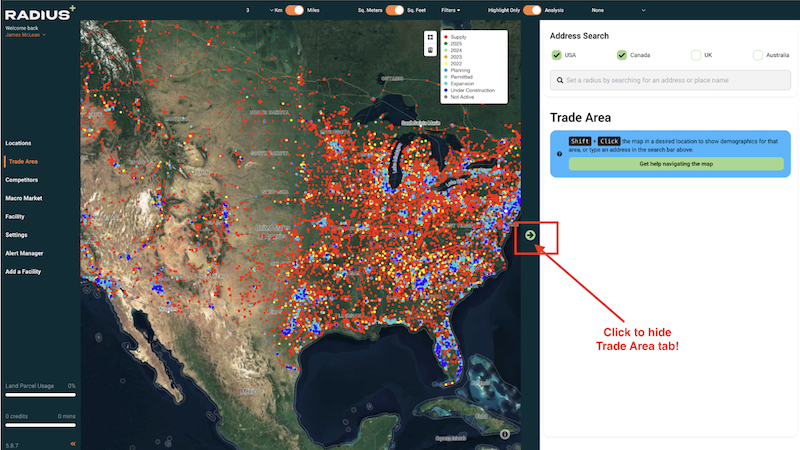
We’ve optimized your workspace by hiding both the left and right panels when they’re not in use. This means more screen real estate for in-depth analysis, data visualization, and decision-making—without distractions.
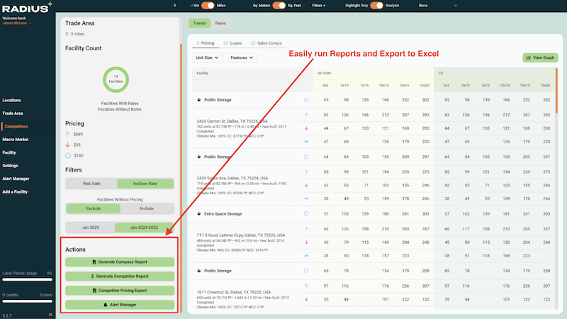
Gone are the days of hunting for icons to pull reports. We’ve replaced them with clear, easy-to-read buttons that make it obvious what each one does. No guesswork—just straightforward functionality at your fingertips.
While we’ve made these enhancements, we’ve been careful to maintain the core design and experience that you’re accustomed to. You’ll still feel right at home, just with a sleeker, more efficient interface.
This refresh is just another step in our ongoing mission to provide you with the best tools for data-driven decision-making.