
06 Dec 2021

Radius 5.0 is a major update to the Radius application. To further improve the user experience, we've added new features and dashboards, as well as enhanced existing ones. Thanks to new and improved functionalities as well as a revised User Interface, using our application has never been easier. The Radius+ team has worked hard to identify measures to improve the user experience, and we believe we have achieved this with the most recent update. We've made significant changes to the Radius+ application to accommodate users and improve their experience.
The Facility Profile Page is one of the most significant enhancements to the Radius application. We've been working hard to improve this component of the application for the benefit of Radius users, and we're excited to provide a new, improved version of the page which is full of additional information helping to improve the user experience and the data which is accessible to all users.
One of the main concerns regarding the previous Facility Profile Page was the user experience. With the latest update to the Radius application, we have aimed to enhance the user experience by creating a Facility Profile Page that has key information users need all in one place. From the Facility Profile, not only can users generate Compass Reports, users will now be able to download Competitor Reports as well. This addition will allow users to be more efficient when on the application, significantly improving the user experience. Along with this, we've also included pricing to Facility Profiles, so users will not have to leave the page to access this information as they had to previously. By providing as much data as possible in one location, we feel that this update will aid in the improvement of the user experience allowing users to be more productive when on the application.
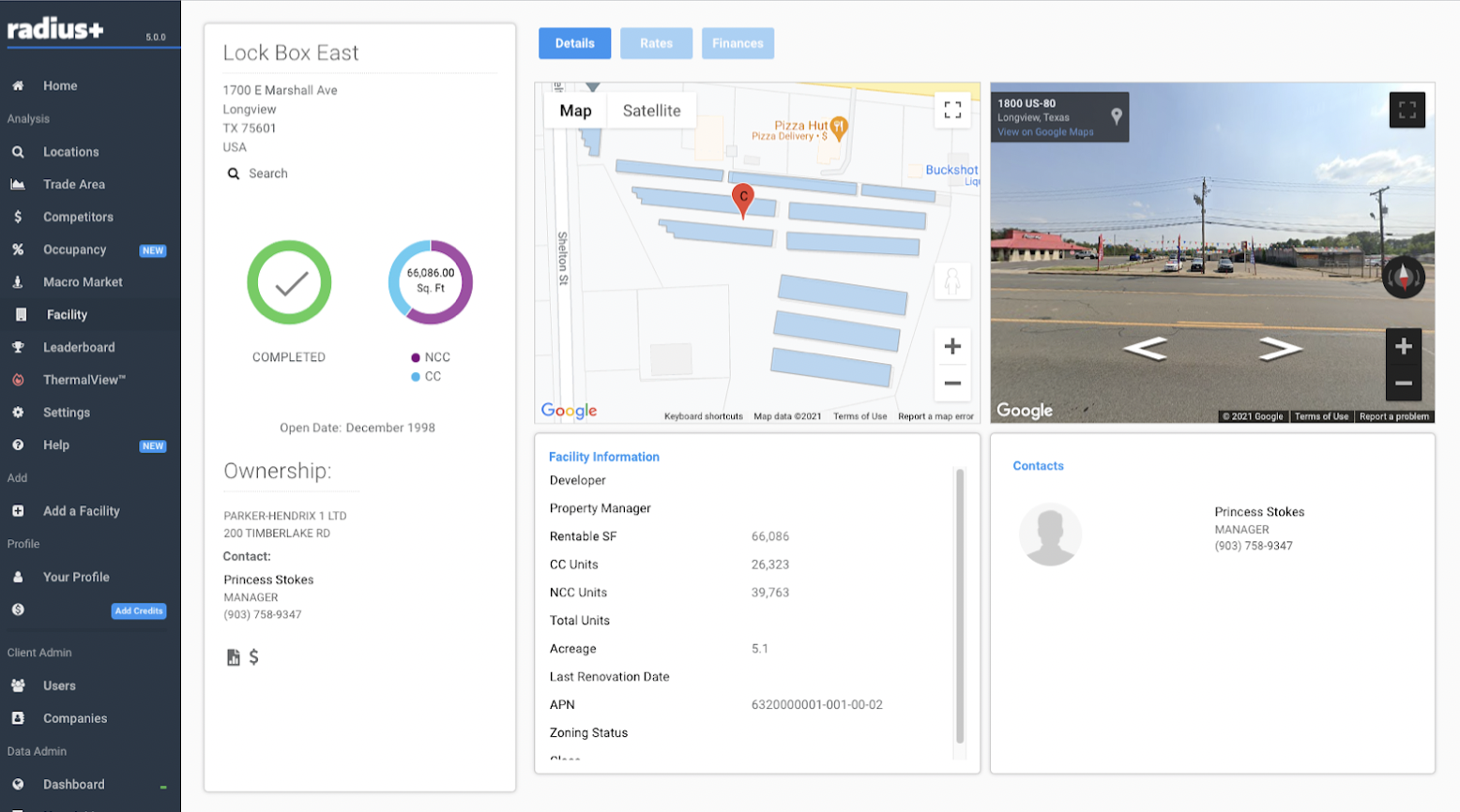
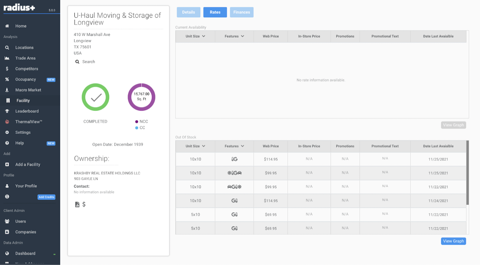
The rates from the selected facility are now visible on the Facility Profile Page, which is a major upgrade to the application. Once again, efficiency and user experience are being improved to help benefit the user. We're excited to announce that any out-of-stock units at the facility will be displayed in the rates section. This is a brand new update and a significant advancement for the application since users can now utilize this data to gauge demand in certain unit sizes. This improvement is intended to offer users as much information as possible, allowing them to see every possible unit size both available and out-of-stock. We have now included ALL unit sizes to the applications pricing table as well, in addition to out-of-stock units. This means that the table will now display all of the different unit sizes that are currently available for that facility, with users having the option to examine as many unit dimensions as they choose. Users will benefit from being able to view as many units as they like and as many dimensions as they like, which is a substantial addition to the Radius application.
We are now introducing Promotion Categorization, which is another upgrade to the pricing table on the Radius application, which can now be viewed from the Facility Profile Page. The "Promotion" section of the pricing table will reveal the promotions, ultimately helping users clearly see the promotion that is being offered. The new update allows Radius users to see exactly what promotions are going on at a specific facility with this information being displayed within the newly improved robust pricing table.
Our newly updated and redesigned Facility Profile Page has been improved to save users time and provide a more efficient platform. The inclusion of detailed information, such as a pricing table and the ability to now view out-of-stock units, will enhance their platform experience by centralizing critical information, all in the Facility Profile Page, eliminating the need to search the Radius application for it. The new user interface is streamlined and makes the page easier to browse; it's well-organized, has cleaner visuals, and will save our users time when using it.
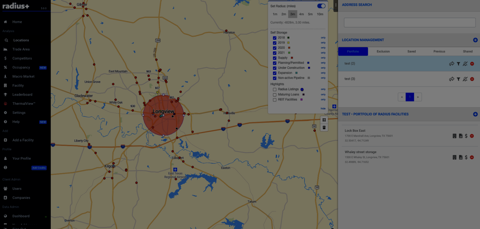
Users' practicality and productivity were key aspects we wanted to improve with the latest update of the Radius application. We decided to develop a Locations dashboard that allowed for convenience and efficiency. The newly introduced Locations platform combines the former Search functionality with Location Management to provide a more convenient and practical feature for Radius users. The two elements were integrated to improve the user experience by producing a cleaner and more effective user interface.
With the Locations dashboard, it is easier for users to now create custom portfolios essentially allowing users to save certain facilities which they are interested in and want to keep track of with ease. By allowing users to easily keep track of their saved locations, it aids in productivity and efficiency.
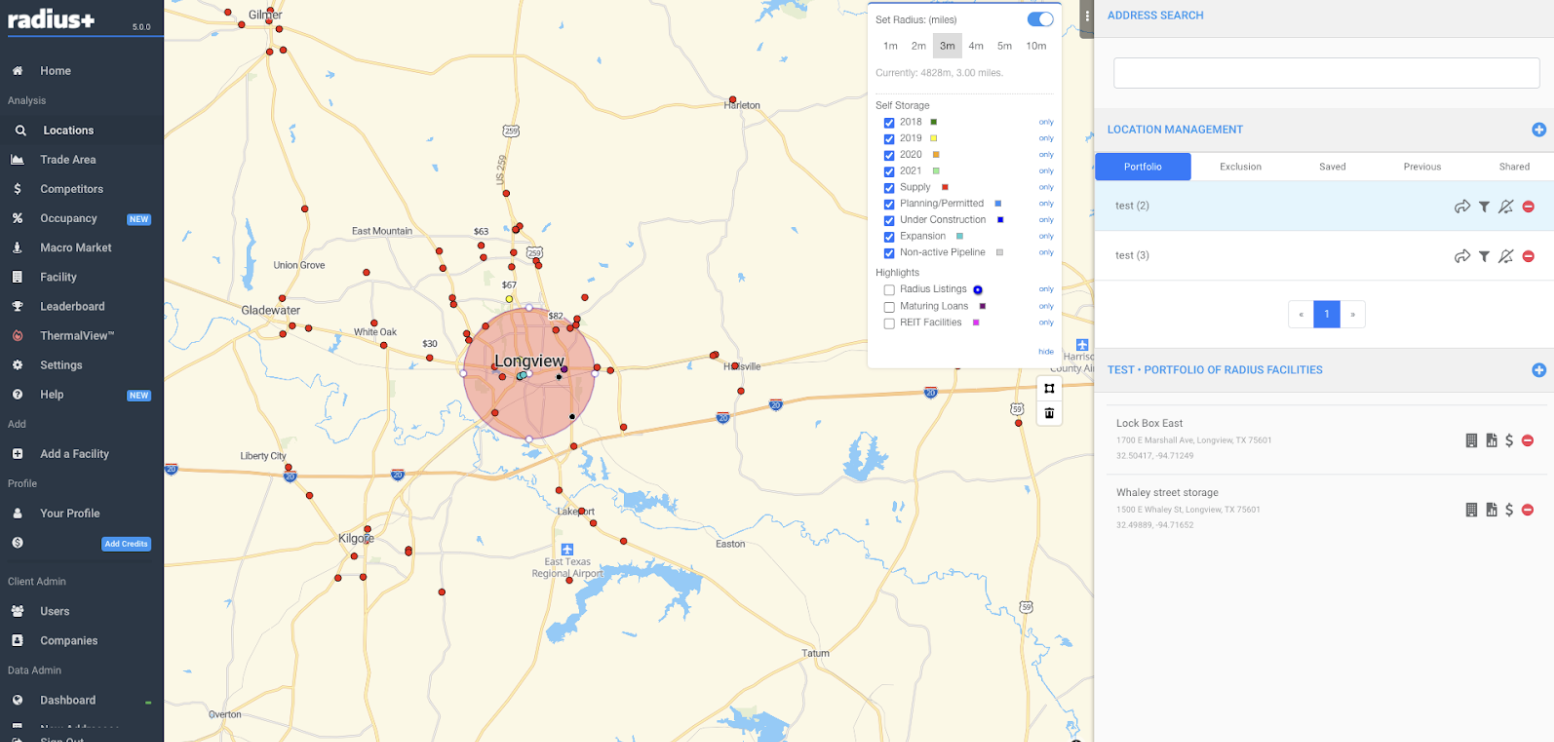
As previously stated, we wanted to increase the practicality of the Radius application for the benefit of its users, thus we created the Locations platform with that in mind. We've made it easier to navigate to the Facility Profile Page from the Locations platform, which saves users time by removing the need to search the application for this information because it's now accessible on the Locations platform. Users may now generate and download Compass Reports and Competitor Reports from the upgraded platform, in addition to accessing the Facility Profile Page. This upgrade will aid in the increase of efficiency for the applications users allowing them to get more from the Radius platform.
The upgraded user interface has a cleaner and simpler look, allowing the application to be more intuitive and easy to use. With a user-friendly layout and simple navigation, we believe that the user will reduce their search time and enhance satisfaction by quickly and efficiently going from one section of the application to another.
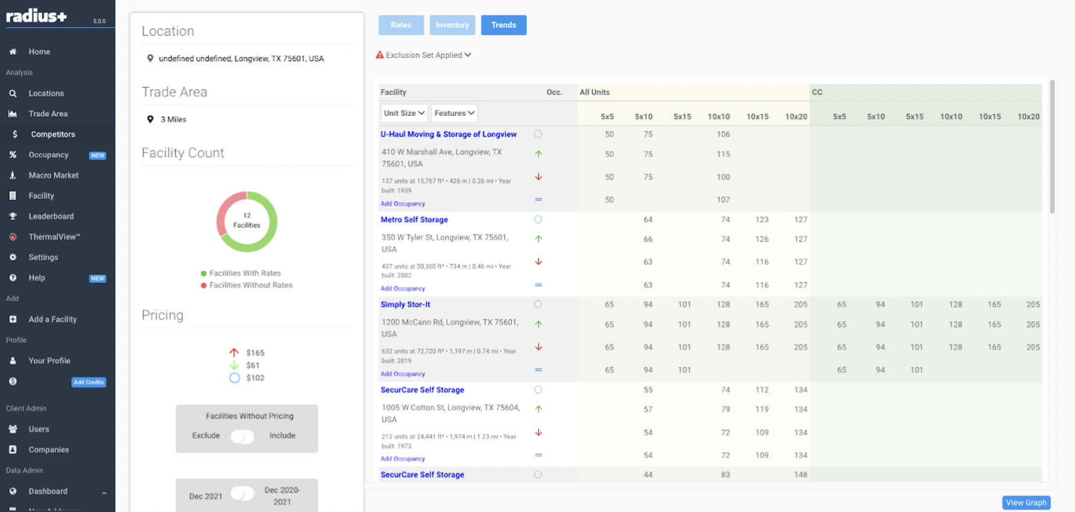
Another new element in the most recent Radius update is the Competitors platform. The Radius application's Competitors platform is a brand-new dashboard that shows pricing and inventory information for the defined trade area. Users will be able to look at as many units as they like in order to view all that is accessible in their chosen trade area. Radius users will be able to assess and analyze more data at once now that they are not limited by the number of units they may examine, making the data more accessible to them and easier to view.
A major feature of the Competitors dashboard is that within the inventory segment users may see the percentage of availability of specific units and feature combinations in relation to the percentage of out-of-stock units within the same graph. This data can prove to be incredibly valuable to know for all the Radius users. With the data and information being displayed on a clean user interface, all users will be able to view and analyze with ease. Helping to enhance users productivity on our application.
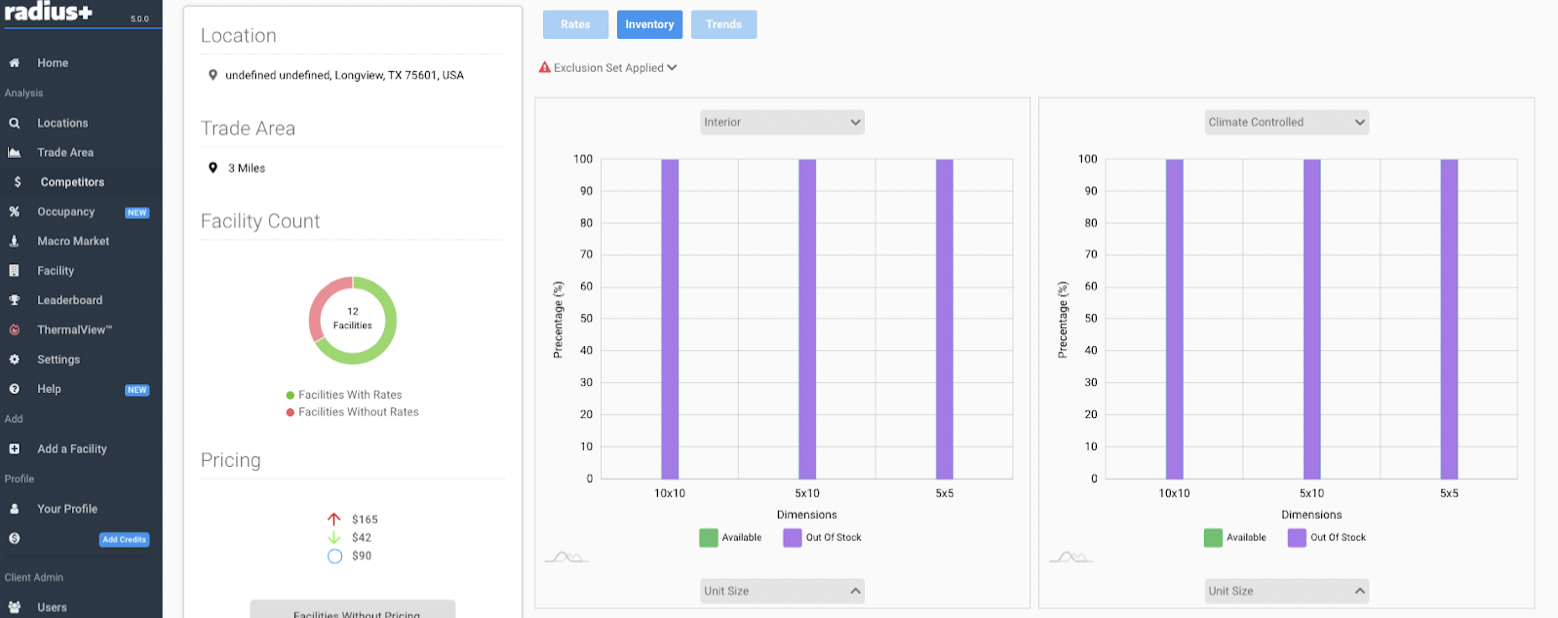
The trends section of the Competitors dashboard is a feature that has been transferred across from the previous pricing page. Displaying the historical pricing for a specific trade area by showing the monthly average pricing for selected units.
Another change users may see is that the previous CBSA Summary has been changed to Macro-Market. However, the dashboard's functionality will stay the same.
These changes have been made to enhance the user experience. We wanted to help users be more productive by eliminating the need for them to search the entire site for certain features. The updated user interface is cleaner and smoother to use, helping to enhance the overall experience for the user.
As always, please get in touch with us if you have any questions.